
5 stories
·
0 followers

The Creative Switch

1 Share

No idea?

Writer's block or lack of ideas can be solved!

The basic recipe for good ideas is really simple:

Just create a lot of options and then pick the best one.
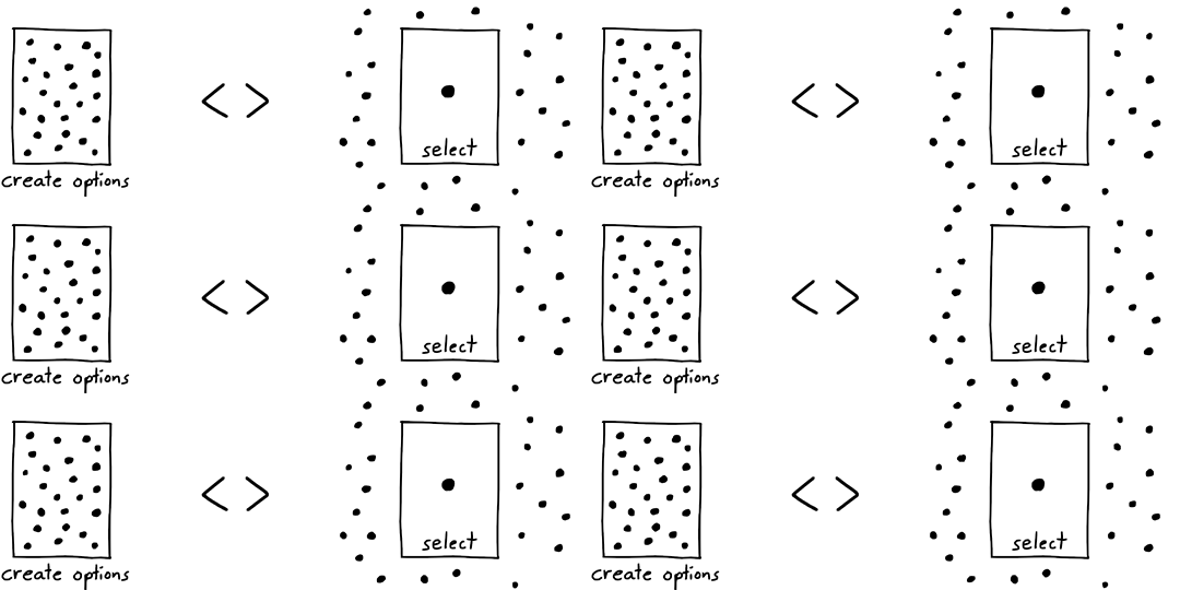
To create ideas you have to generate many options and select the best one.

But why is that so hard?

Because for each of those two steps we need to be in a different mood.

The crazy mood

We have a lot of ideas—all the time. But most of them… are pretty stupid. This is why we stick to what is normal, what has worked before. We stick to convention. This protects us from making stupid decisions.

Normal.

But when we need new ideas this normal way of thinking doesn’t work. The new ideas are outside of what is normal, they live among the crazies. 

To catch them we have to become crazy—well, at least a little. With “crazy” I mean: We have to step outside convention and disrupt our normal way of thinking.
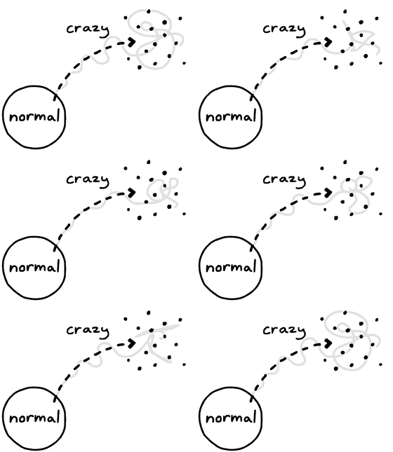
Crazy


But first we must prepare: We need to know roughly what we want. For example, if we want to think up an original birthday present for someone, then we should do a little research about this person’s everyday life. Knowledge is the raw material for ideas.

Knowledge is the raw material for creativity

We should also establish a rough direction for our idea hunt. Should the birthday present be useful? Should it make the person laugh?

direction

Now we can let our thoughts run wild—and I mean: wild! Everything is welcome: the banal, the obvious, the outrageous, the megalomaniac, the awkward, and of course the downright stupid—bring them on!

crazy mood

The only problem is: there is a nagging censor in the back of our minds—or sometimes sitting across from us—who is eager to point out which ideas are bad and why.

Here is a trick to shut the censor up: Focus on quantity! For example, make it a game to come up with 100 stupid ideas in 10 minutes. Then we simply don’t have time to judge. And this opens the floodgates for our crazy creative mind. 

And those ideas are flaky, which is why we have to be quick. Write them down! Make drawings! Don’t let them get away.

Oh, and have fun! Ideas are attracted to laughter.

But isn’t that silly? Why would we collect a pile of stupid ideas?
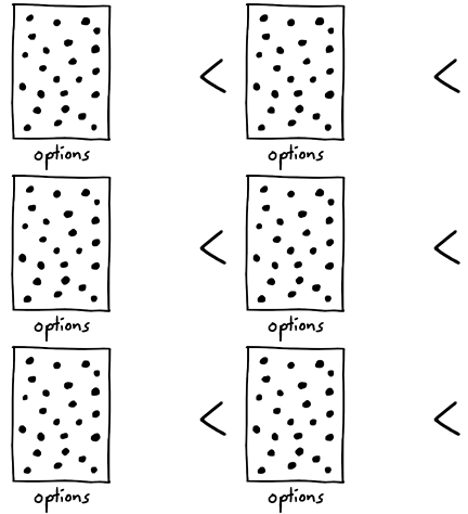
options

Because the good ideas are hiding among them!

Of course, if we stay in the crazy mood we won’t be able to spot them. This is why—after we have gathered a huge number of ideas—we have to switch to the sober mood.

The sober mood

Now it is time to bring back that critic in us and be reasonable. Because the good news is: We are not staring at a blank piece of paper anymore. But the bad news is: We are also looking at a lot of nonsense.
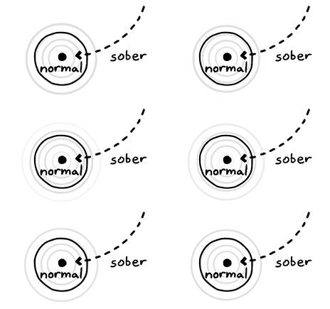
sober mood

It is time to separate the wheat from the chaff. We start by structuring the ideas. Are some of them similar? Do we like some of them, even though they are stupid? Why?

structure

We also run thought experiments to figure out how these ideas could work and ask the question „What if…?” So for example, you want to give the person an elephant as a birthday present because he likes elephants. Maybe that is a bit too much responsibility. What if we went to the Zoo instead?

what if?

We are not simply excluding bad ideas. We try to come up with ways to make them work. But of course, at some point, we have to make decisions—and chuck the bad ones in the bin.

select one

If we are lucky, then we might end up with one or two ideas to work with.
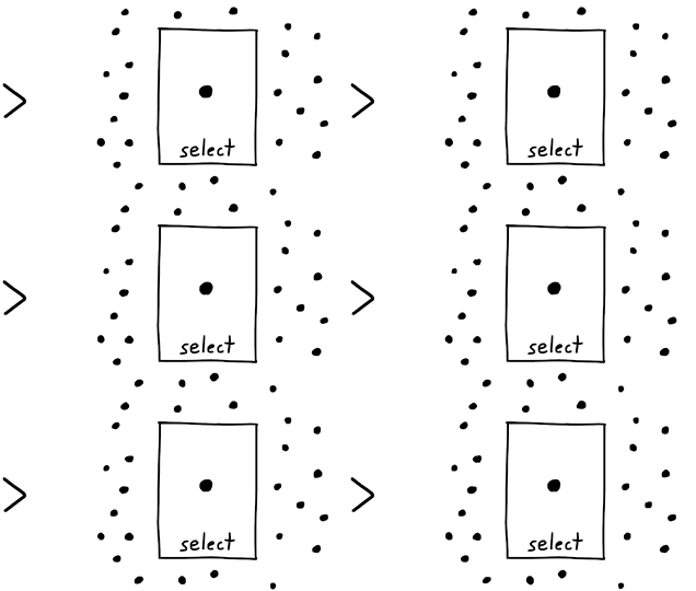
selection

If we are not, then we can rephrase our initial goal, gather more information, or simply sleep on it—and start the whole process again.

What could possibly go wrong?

Three things: 

Danger 1: Lost in crazy 

It is tempting to stay crazy and keep generating stupid ideas forever. After all, it’s fun!

lost in crazy

We might even fool ourselves and mistake confusion with creativity. But let’s remember: An idea is not innovative if we do not order, test, and refine it. New is not always better. We need the sober mood!

Danger 2: Stuck in convention

On the other hand, if we don’t leave our conventional way of thinking—we are stuck. We stare at white sheets of paper.
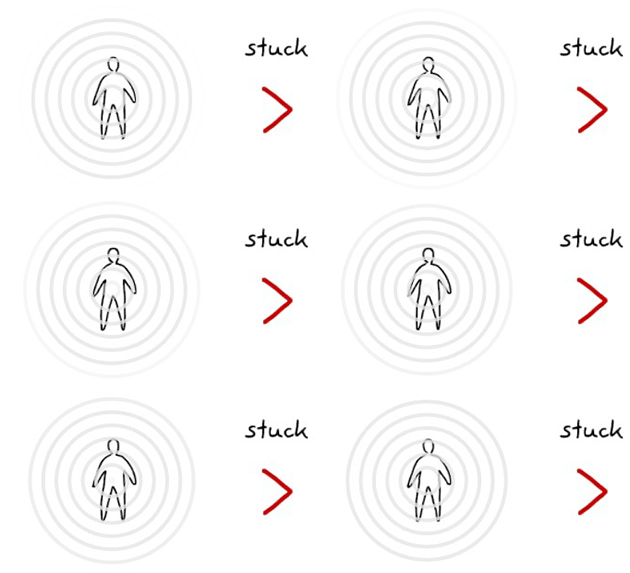
stuck in convention

This is boring. We need the crazy mood!

Danger 3: Choke

We must do both of these phases, but—and this is important: We must not do them at the same time!

choke

We can’t be wild and orderly at the same time, just like we can’t breathe in and out at the same time. We must alternate between the two phases—and with it our moods.

This is why, when we are in the crazy phase, we must silence our nagging inner critical voice.

This is also why we should not suddenly go crazy and “have new ideas” while our orderly mind is trying to make sense and clean up our mess.

We have to do one phase at a time. 

creativity

Know where you are (right now)

The key to good new ideas is to control these two moods

We must learn to switch between crazy and orderly and make it a creative habit.

If we work in teams we need to agree on which phase we are currently in.

I like to condition myself to make this switch easier. I use rituals, for example by arranging stimulating drawing tools or preparing a strong cup of tea. I sometimes work in different locations for different moods.

Yet my most important tool is drawing. Read “How to draw ideas” to find out about 4 ways in which drawing can boost our creativity.

Before you go

If you enjoyed this article, then subscribe to my mailing list to receive more animated stories!

The post The Creative Switch appeared first on Ralph Ammer.

Read the whole story
janmon
670 days ago
reply
Share this story
Delete

My talk on CSS runtime performance

1 Share

A few months ago, I gave a talk on CSS performance at performance.now in Amsterdam. The recording is available online:

(You can also read the slides.)

This is one of my favorite talks I’ve ever given. It was the product of months (honestly, years) of research, prompted by a couple questions:

  1. What is the fastest way to implement scoped styles? (Surprisingly few people seem to ask this question.)
  2. Does using shadow DOM improve style performance? (Short answer: yes.)

To answer these questions (and more), I did a bunch of research into how browsers work under the hood. This included combing through old Servo discussions from 2013, reaching out to browser developers like Manuel Rego Casasnovas and Emilio Cobos Alvarez, reading browser PRs, and writing lots of benchmarks.

In the end, I’m pretty satisfied with the talk. My main goal was to shine a light on all the heroic work that browser vendors have done over the years to make CSS so performant. Much of this stuff is intricate and arcane (like Bloom filters), but I hoped that with some simple diagrams and animations, I could bring this work to life.

The two outcomes I’d love to see from this talk are:

  1. Web developers spend more time thinking about and measuring CSS performance. (Pssst, check out the SelectorStats section of my guide to Chrome tracing!)
  2. Browser vendors provide better DevTools to understand CSS performance. (In the talk, I pitch this as a SQL EXPLAIN for CSS.)

What I didn’t want to do in this talk was rain on anybody’s parade who is trying to do sophisticated things with CSS. More and more, I am seeing ambitious usage of new CSS features like :has and container queries, and I don’t want people to feel like they should avoid these techniques and limit themselves to classes and IDs. I just want web developers to consider the cost of CSS, and to get more comfortable with using the DevTools to understand which kinds of CSS patterns may be slowing down their website.

I also got some good feedback from browser DevTools folks after my talk, so I’m hopeful for the future of CSS performance. As techniques like shadow DOM and native CSS scoping become more widespread, it may even mitigate a lot of my worries about CSS perf. In any case, it was a fascinating topic to research, and I hope that folks were intrigued and entertained by my talk.


Read the whole story
janmon
673 days ago
reply
Share this story
Delete

JavaScript, Community

1 Comment

I’ve been a full-time professional web developer for 17 years. In that time, I’ve seen things.

I remember when web browser developer tools were first introduced, using Firebug for the first time.

I predate even the WebKit mobile revolution: a time when proxy browsers reigned supreme and Blackberry was king.

I bore witness to the React schism, ruthlessly popularizing Single Page Apps and clientside rendering; giving rise to a slower web in the name of developer experience.

I embraced the npm revolution.

I rode the waves of Node.js.

I webpacked across The Great Divide.

The Great Divide #

The Great Divide really resonated with me. I keep coming back to it and I do think it continues to accurately describe what feels like two very distinct and separate camps of web developer.

The question I keep asking though: is the divide borne from a healthy specialization of skills or a symptom of unnecessary tooling complexity?

“Shout out to web developers that don’t feel (or haven’t felt) like they belong in the JavaScript community—you are important and your opinions are valid.”—December 9, 2022

I ran a JavaScript meetup for six years (2012-2018) and a JavaScript conference for five years (2015-2019). I maintain Eleventy, a JavaScript Open Source project. But I would never identify as being on the JavaScript side of The Great Divide.

Folks that know me from my time at Filament Group and my work with web fonts would likely place me on the User Experience side of the divide. I feel more at home there.

But I also vehemently reject that I have to exclusively choose one side, and perhaps that is best reflected in my work on Eleventy.

Mirror, Mirror #

The disconnect manifests itself time and again as accepted truths in the JavaScript community to me feel like anything but. I was reminded of that again today when I visited the 2022 State of JavaScript results.

“Solid and Qwik are suggesting that React might not have all the answers”—Source

Well, wait. When you’re straddling the divide, you pretty clearly recognize that React never had all of the answers.

“Astro, Remix and Next.js (among others) are making us reconsider how much code we really need to ship to the client.”—Source

Well, wait. When you straddle the divide, you know that Remix (67.7 kB compressed) and Next.js (90 kB compressed) have not meaningfully reduced their bundle sizes at all. Measurement reveals that bundles are growing: Next.js was 72.2 kB compressed in 2021.

The Great Dissonance #

This JavaScript community (if judged by the demographics of this survey) seems to be comprised mostly of folks that are largely building with React, webpack, and Jest. With React on 3.2% of web sites and jQuery at 77.7% (as of January 2023), that’s a pretty small slice of a much larger community.

We seem to live in different worlds.

I want to be a web developer, not a JavaScript developer.

If you live in a different world too, we should be friends.

Read the whole story
janmon
678 days ago
reply
👏
Share this story
Delete

A year of new avenues

1 Comment and 2 Shares
It's 2003 again.
Read the whole story
janmon
679 days ago
reply
Love this so much
Share this story
Delete

Retiring Pinafore

1 Comment

Five years ago, I started a journey to build a better Mastodon client – one focused on performance and simplicity. And I did! Pinafore is the main Mastodon client I’ve used myself since I first released it.

After five years, though, my relationship with social media has changed, and it’s time for me to put Pinafore out to pasture. The pinafore.social website will still work, but I’ve marked the repo as unmaintained.

Why retire Pinafore?

I don’t have the energy to do this anymore. Pinafore has gone from being a fun side project to being a source of dread for me. There is a constant stream of bug reports, feature requests, and pull requests to manage, and I just don’t want to spend my free time doing this anymore.

By the way, this is not my first rodeo. Read this post on my breakup with another open-source project.

Why not pass it off to a new maintainer?

Running a fediverse client requires trust. People who use Pinafore are trusting me to handle their data securely. As such, I’ve been meticulous about using good security headers and making pro-privacy decisions. A new maintainer (through malice or ignorance) could add new functionality that compromises on security or privacy, essentially trading on my good name while harming users.

Over the years, I have had lots of feature requests that would inadvertently cause a privacy or security leak, and I’ve pushed back on every single one. (E.g. “Why not contact third-party servers to show the full favorite/boost count?” Well, because users may trust their home server, but that doesn’t mean they trust random third-party servers.)

Rather than trust that a new maintainer will keep these high standards in place, I’d rather put Pinafore in a frozen state.

Why not shut it down entirely?

Thanks to Vercel’s generous free tier, Pinafore costs me $0 per month to run. It’s just static HTML/CSS/JS files, after all.

Why are you the sole maintainer?

I’m not – there have been tons of contributions through the years. But for the most part, these have been “drive-by” in nature (nothing wrong with that!), rather than someone deeply learning the codebase end-to-end.

I suspect one of the reasons for this is that Pinafore is written in Svelte v2 and Sapper – both of which are deprecated in favor of Svelte v3 and SvelteKit. Not only is there no migration path from Svelte v2 to v3, but there isn’t one from Sapper to SvelteKit either. (And on top of that, I had to fork Sapper pretty heavily.) Anyone making a bet on learning Pinafore’s tech stack is investing in a dead framework, so it’s not very attractive for new maintainers.

So why didn’t I bother updating it? Well, it’s a lot of work to manually migrate 200+ components to what is essentially a new framework. And plus, as far as I could tell, it would be a pure DX (Developer Experience) improvement, not a UX (User Experience) improvement. (I just wouldn’t be using any of SvelteKit’s new features, and Svelte v3 doesn’t seem to have massive UX improvements over Svelte v2.)

What did you learn while writing Pinafore?

Now here’s an interesting question! And one that may be useful for those building their own Mastodon (or fediverse) clients. It is my sincerest wish that Pinafore inspires other developers to build their own (and better!) clients.

API and offline

First off, ActivityPub does have a client-to-server API, but as far as I can tell, it’s not really worth implementing. Mastodon is the 800-pound gorilla in the fediverse, it doesn’t implement this API, and other servers (such as Pleroma and Misskey) implement their own flavor of Mastodon’s API. And plus, Mastodon’s REST API is pretty sensible and doesn’t change too frequently. (And when it does, they add a /v2 endpoint while still maintaining the /v1 version.)

However, the fact that Mastodon has a fairly bog-standard REST API makes it pretty difficult to implement offline support, as I did in Pinafore. Essentially, I implemented a full mirror of Mastodon’s PostgreSQL database structure, but on top of IndexedDB. On top of that, I had to implement a variety of strategies to synchronize data between the client and server:

  • As new statuses stream in, how do you backfill ones you may have missed if the user went offline? Well, you have to just keep fetching statuses to fill the gap.
  • How do you deal with deleted statuses? Well, you have to remove them from the in-memory store, and the database, and then also go ahead and delete any statuses that boosted them or notifications that reference them… It’s a lot. (And don’t get me started on editing statuses! I didn’t even get around to that.)
  • How to deal with slow servers? Well, you can implement an optimistic UI that shows (for instance) a “favorited” animation while still waiting for the server to respond. (And also cancels if the server responds with an error or times out.)

From my years working on PouchDB, I know that it’s a fool’s errand to try to implement proper client-server synchronization without a holistic plan for managing revisions, conflicts, and offline states… and yet, I did it. The end result is pretty impressive in my opinion, even if arguably it doesn’t add a lot to the user experience. (There’s not much you can do in a social media app when you’re offline, and I’m sure people still frequently have to refresh when stuff gets out-of-date.)

Performance

Speaking of which, refreshes should be fast! And I believe Pinafore is pretty good at this. (I can’t find the link, but someone did a recent analysis showing that Pinafore uses less CPU and memory than the default Mastodon frontend.)

In short, I’d say it’s entirely possible to build a performant SPA (despite some of my misgivings about SPAs). But it helps if:

  • You have a browser perf background (like me).
  • You’re only one developer. (Much harder to implement tricky perf optimizations if you have to explain it to your colleagues!)
  • You use a perf-focused framework like Svelte.
  • You don’t do much! Pinafore has a fraction of the features of the main Mastodon frontend.
  • You’re merciless about removing dependencies, or writing your own dependencies when the existing ones are too slow or bloated.
  • You’re meticulous about little micro-optimizations (e.g. debouncing, event delegation, or page splitting) that improve the user experience, especially on low-end devices, but make the developer experience a lot worse.

Not all of this is necessary to make a fast, fluid API, but it certainly helps. And the fact that I ended up building something that can run on feature phones gives me a lot of satisfaction.

Accessibility

I didn’t set out to write “the accessible Mastodon client,” but I’ve heard from a lot of folks that Pinafore is one of the better ones out there, especially for blind users.

For this, I mostly have to thank Marco Zehe and James Teh (among others), who provided tons of feedback and really helped with the polish of the screen reader experience. Accessibility isn’t always black-and-white – like anything in design, sometimes there are tradeoffs and differing opinions on what the best option is. Leaning on the expertise of actual blind users gave me insights that I couldn’t have had otherwise.

Another thing that helps is just giving a damn. When I started on Pinafore, I didn’t really know much about accessibility, but I decided it was time to finally learn. I started off with a basic intro to screen readers from Rob Dodson, played around with VoiceOver and NVDA, and tried to read and understand as much as I could. I wouldn’t call myself an accessibility expert, but I’ve made a lot of progress in the past five years, and now I wince when I look back at some of the code I wrote in the past.

In the end, I found accessibility to be quite rewarding. Rather than feeling like a chore or a box-ticking exercise, it feels like a fun challenge. In some cases it’s just about leaning on existing web standards, but in other cases it feels like you’re building a parallel semantic UI to the visual one. Sometimes I found that this even influenced the overall architecture of my code – which goes to show that it’s better to consider accessibility upfront rather than as an afterthought.

That said, I definitely messed up some stuff when it comes to accessibility – color contrast in particular is something I did a poor job on. (Luckily Nick Colley has put a bunch of work into Pinafore to improve this!)

Conclusion

Pinafore was a fun project. I learned a lot about web development while working on it. Often, when a new feature landed in browsers – e.g. color-scheme, maskable icons, or various Intl APIs – I would eagerly integrate it into Pinafore, which helped me learn more about how browsers work.

In another case, I went a bit overboard on building my own emoji picker for Pinafore, and in the process learned way more than I ever wanted to know about fonts and emoji rendering.

I also think that Pinafore accomplished many of the goals I had in mind when I originally wrote it. At the time, Mastodon only had a multi-column UI, which many users found overwhelming and confusing. Pinafore demonstrated that a single-column layout could be a viable alternative, and since then, Mastodon has defaulted to a single-column layout.

Back then, there was also only one web-based Mastodon client (Halcyon), and it didn’t support logging in to more than one instance at a time. Pinafore proved it was possible for a web-based client to do this (not obvious given CORS constraints!), and nowadays there are lots of web-based clients, such as Sengi, Cuckoo+, and Elk, and many of them support multi-instance logins.

Pinafore isn’t going anywhere – like I mentioned, the site is still up and running. I also think it could serve as an interesting point of comparison for other Mastodon clients. (Try to beat Pinafore on performance and accessibility! I think that would be a great outcome.)

I also want to thank everyone who followed along with me on this journey over the years, and who either used Pinafore, filed a bug, or contributed to it. Thank you for giving me one of my career-defining projects over the last half-decade. It wouldn’t have been possible without your help.


Read the whole story
janmon
679 days ago
reply
Sad to see Pinafore go. Thanks Nolan for the great work!
Share this story
Delete